We wanted to give our project a name and a logo! It should imply what we are doing, how we are doing it and where this is going to take us.
Overlandys goes back to the word overlander – with a pinch of cuteness and plural, because there are two of us.
An overlander is someone traveling overland. On their travels, overlanders are on a certain route, but it is neither the direct one nor the one that tourists would take. Their route leads to faraway and remote places. To get to these places, overlanders are traveling with their own vehicle, which is also their home. This kind of travel makes it possible to travel longer and stay away from tourists and their touristy destinations, those that are only a day trip away. Overlanders are often traveling alone, but are never lonely; they regularly meet locals and other overlanders. Unlike people with RVs (traveling comfortably in their motorhomes, spending another vacation on a campground) or off-roaders (on the road with their 4×4 vehicle, always searching for another mud hole to drive through, taking the vehicle to off-road limits) overlanders are on the road for longer, living autarkic and independent. Nevertheless, the ideas and goals of people with RVs and off-roaders blend with the ones of the overlanders: traveling with a tiny home on wheels as well as driving through tough terrain. Overlanders extend these goals by flexibility, independence, cultural experiences as well as being one with nature and the environment.
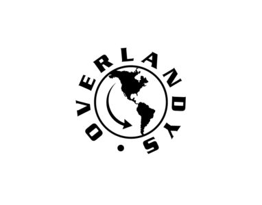
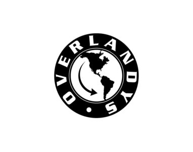
To visualize our project, we designed our own logo. We preferred a round logo to a square one, and this lead us to the outline of a tire. The tire tread indicates the off-road part of our travel. The illustration of the American continents in the middle immediately suggests where we are traveling, the arrow indicating the direction. And of course our name should be a part of the logo and therefore it is circling the logo like a caption on the tires.
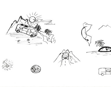
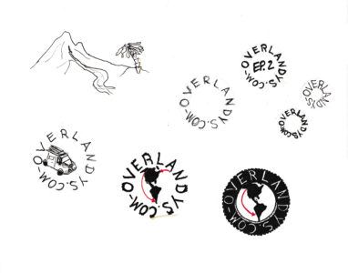
Jan spent a lot of time sketching different logo ideas, so here you find some of them.

